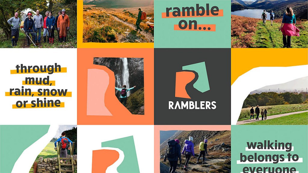
Campaigning charity the Ramblers has unveiled a new logo and corporate identity.
The organisation said the emblem represents an open path and uses earthy colours to emphasise its values.
Carol Flint, head of brand for the Ramblers said: “Our new identity presents the Ramblers as the inclusive, vibrant community we are, unified by an important cause. We’re delighted to share it with the world – it reflects that we’re so much more than a lifestyle club for walkers.”
A spokesperson for the charity said: “The new identity will play a pivotal role in the Ramblers engaging, inspiring and encouraging everyone, everywhere to enjoy walking.
“It will help us to reach new supporters for our vital campaigning work, and to provide the very best experience for our members. It also gives a single, compelling branding to all aspects of the Ramblers’ work – uniting our national organisations and local groups, and bringing the Ramblers Wellbeing Walks network of shorter ‘health’ walks fully into the Ramblers community.
“As people across Britain increasingly look to walking to get fit and boost their wellbeing, the Ramblers’ new identity includes a new logo as part of a whole new visual identity.
“Rooted in the idea of ‘opening the way’ for everyone to walk however they choose, these will enhance the Ramblers ongoing, 86-year-old aim to do everything we can to improve and protect the pleasures of walking.”
The charity traces its roots to 1931 with the formation of the National Council of Ramblers’ Federations which in 1935 changed its name to the Ramblers’ Association.
In March 2009 the organisation became known by the shortened name the Ramblers.


John Bainbridge
20 January 2022Awful
zorrodp
20 January 2022Plus ca change? Similar sentiments were expressed about the last change ......
We may no longer be .......
https://youtu.be/OdGphk-XTh8
And we've come a long long way together in over 11 years ....
"So why the need for a change, now? The 140,000-strong organisation’s membership is altering, it says. There are more under 40s; more people are undertaking urban walking and there is a growth of ‘themed’ walks, such as films strolls and love hikes.
The new Ramblers' logo
So the rolling green hills have been put out to pasture .........
There is also to be a move towards making walking accessible to all abilities and backgrounds, a broadening of the movement towards persuading more people to give up their couch-potato life and get on their feet. The Get Walking Keep Walking campaign aims to get 90,000 inner-city dwellers more active."
'Who’s for a drum-and-bass version of The Manchester Rambler?'
Nope, haven't found one so far ....
https://youtu.be/2N_wU0wsp8k
Ian S
20 January 2022Who on Earth thinks up this sh1te?
Sam Torrence
21 January 2022Carol Flint, head of brand for the Ramblers said: “Our new identity presents the Ramblers as the inclusive, vibrant community we are, unified by an important cause. We’re delighted to share it with the world – it reflects that we’re so much more than a lifestyle club for walkers.”
_________________________
Apologies if I'm being a bit thick but how on earth can a logo "represent the Ramblers" as the things Carol Flint says. And even if it does, what the hell do they mean.
What a load of nonsense.
Ian S
22 January 2022Exactly, Sam. It's the usual bland corporate bullsh1t. People actually get paid for thinking up that sort of cr4p. It's going to turn people off, not encourage them.
John Bainbridge
22 January 2022And why are they using members' subs to pay for a creature called a Head Of Brand?
Colin H
22 January 2022Sorry, all I could see when I saw the bobble hats was . . . . . . carrots!
Colin H
22 January 2022Sorry, all I could see when I saw the bobble hats was carrots!
Hugh Westacott
22 January 2022I’m afraid the traditional fire in the belly of the Ramblers has been extinguished and replaced with corporation-speak. I joined in 1970 and resigned my Life Membership a couple of years ago in protest at the way it was being run.
Unless it changes it’s doomed because it’s expensive to join and there are so many cheaper, locally-based alternatives.
John Bainbridge
23 January 2022Agree with Hugh. I hang on. But where is the spark of campaigning zeal>
Ana
25 January 2022Like the new design. The change of name from Rambler's Association to the Ramblers was a worse idea. Change helps bring in a new generation & change is a necessity of life. When is the bobble hat available to buy?
Tinnishill
26 January 2022Petronius Arbiter, 2000 years ago, wrote, "I was to learn later in life that we tend to meet any new situation by reorganizing, and what a wonderful method it can be for creating the illusion of progress while actually producing confusion, inefficiency, and demoralization.”
Anna Studholme
28 January 2022Its bland and has a subdued feel. The bobble hats are fine but wheres the vibrancy and positivity in that colour palette... Sorry buts its a big thumbs down from me
Anna Studholme
28 January 2022Its bland and has a subdued feel. The bobble hats are fine but wheres the vibrancy and positivity in that colour palette... Sorry buts its a big thumbs down from me
Margaret North
20 May 2022Looks unfinished. Is this really the final one?
Very childlike... and I'm not sure that's part of the vision?
Really disappointing as I love this organisation. Bet we'll see another new logo and branding in a few years time.